Avengers vs X-Men #1: The Unsolicited Opinion

I spent a good part of my Wednesday looking up Avengers vs X-Men reviews. I have a few of my own opinions, but first, here's a conglomerate of some comics journalists:

Comic Book Resource's Kelly Thompson is a little unhappy with the Avengers' lack of taking a position, but forgives the comic and gives it a 4/5 star rating:
There are a lot of quality creators involved in "Avengers Vs. X-Men," enough that I find myself intrigued even though the concept is not one I'm wild about. This first issue was a good example of the creative talent managing to rise above the concept and leaves me hopeful they'll be able to bring something even more interesting to the table as the series progresses.
Newsarama's Michael Doran seems more interested in saying that the comic book is a comic book, and doesn't bring up its quality as a comic book. He concludes by saying that the comic book issue is to catch up non-readers who haven't been following every little preview:
Again, the issue is a perfectly competent piece of graphic fiction. It probably plays best with those who haven’t followed all the advance publicity and thus don’t know all the story beats already, which is maybe the point.
I'm pretty fond of Comicsalliance's write-up, from Andrew Wheeler. It's not a qualitative evaluation of it, but it's a funny summary that pokes fun at it:
Iron Man tells the President that he has "run the math" fifty ways on the "energy signature" they found on Nova's uniform and it definitely means the Phoenix Force is coming to get them. That's math you can take to the White House! Math, you may recall, was also crucial to the Civil War crossover, when Reed Richards used math to prove that the plot was necessary. Math is there for those times when having The Watcher turn up and say, "It is so" just doesn't have the narrative authority you need.
And then there's Comicvine. It's a great community, with a lot of different minds coming together to talk about a shared love. But they give high ratings like a hooker gives handjobs. Tony Guerrero rated it a 5/5:
This is the beginning of Marvel's huge event. Keep in mind that the high score given to this comic reflects the nature of the issue and what it represents. AVENGERS VS. X-MEN is going to be a blast to read.
That's just silly. Why judge a comic book on what it will be? Does hype make a comic book better? A comic book ought to be judged on what it is: the first issue should be judged by the first issue, not by how the second issue is predicted to be. Comic book readers, myself included, have this tendency to hope for the next issue to be better than the one they just read, no matter how bad it was. "There's always the next issue," they say. That's absurd. A bad comic book issue is a bad comic book issue, regardless of the next issue.

I don't mean to say that Avengers vs X-Men #1 is a bad comic book issue. It has the mighty Marvel hype machine behind it, and it's going to sell whether it's awful or not. It's going to be one of 2012's biggest comic books, and of all the comic books out there, it's going to get into an amazing number of hands.

And because of that, this comic book needs to be an example of Marvel's best stuff. They need to put their best foot forward, and in that sense, this comic book issue, even if it isn't a bad comic book issue, was a disappointment. Here's why.


The splash pages don't work. The second and third page has this huge spread of a phoenix raptor taking over two pages. It doesn't look big at all. The credits overshadow the village, so there's a poor sense of scale. As a two-page spread, it's disposable and could've been used better.

In terms of the writing, very little new information is conveyed beyond what was already in the previews. If you haven't followed the previews, I don't think this will be a concern. For everyone else, ie, me, it will be.


Check out this shot of Cap landing on the mutant island Utopia. Why is the Captain hitching up his pants? Aren't they tights? Why isn't he facing Cyclops? Would he rather stare wistfully at the ocean while discussing policy with the herald of the mutant community?

I love John Romita Jr. I hold his work on Amazing Spider-Man, with JMS, very close to my heart. But he has strengths and weaknesses like every other artist. Romita Jr. works great with motion, action, but a talking scene for him is absurd. The argument between Cyclops and Cap is very weak, because they have to rely on these silly finger-pointing motions to spice up the panels. Romita Jr. is renowned for his speed, but maybe he should have taken some more time on these pages.

Look at this panel of Thor:

Dang, Thor. You really care about avenging don't you? In fact, you must care so much that -- agh! I spilled my coffee!

Glaagh! I stubbed my toe!


Huarrghh! I burnt my toast!


. . . yeah. Look at this last picture of Magneto.
from Avengers vs X-Men #1, by Bendis, Romita Jr, Hanna

Erik, what are you looking at?

Erik, are you there? Erik???

Dammit Erik look me in the eyes!

So there's a lot to complain about, but, there are no ads. There's about 36 pages of story, as well as an added Infinite #1 digital issue if you have a device that's Marvel AR-capable. The art may not be the highest quality, but the value is. I'll complain about the comic book, but Avengers vs X-Men #1 is worth a look for yourself. High-profile work is important for the comic book community, and I think that's why the comics journalists have rated this issue so highly. For everything else, there's dumb bloggers.

Buy this issue digital: comiXology | Marvel

Follow chezkevin on rss | twitter

Best sound effect ever?


Spider-Man punches Al Gore in the face. Don't ask.

This is from this week's Amazing Spider-Man #683, with Dan Slott and Stefano Caselli, in stores now.

Dan Slott, you've done this before as well: Amazing Spider-Man #569, with John Romita Jr. No idea if it's intentional, but thanks!

Follow chezkevin on rss | twitter

Serials for today: Ultimate Comics Spider-Man and Batwoman


Ultimate Comics All-New Spider-Man #8
by Brian Bendis, Sara Pichelli, Justin Ponsor
cover by Kaare Andrews

Kaare Andrews has been doing a lot of these hyper-realistic covers for the Ultimate line, and I'm not sure how I feel about it. During 2008, he had an amazing cover run of The Incredible Hulk (#34 -#54, see here), where he experimented with tons of dif
ferent styles, and these don't allow him to do that.

Anyways, the issue: I feel like this is one of the first, to be a "full" issue. I liked it, and I felt like the story was worth the pages it was printed on. Bendis manages to tell a classic Spidey melodrama that Stan and Steve themselves built up: It's this incredible rush to jump around and be Spider-Man, but the secret identity can cause a lot of grief in your life. That's the same dilemma that Miles faces, and it still works today.

Bendis continues to hint at what makes Miles so different too: he just doesn't know how to be a super hero! Here he defeats the Ring while captured in the Ring's. . . rings. Miles, you definitely win the award for Most Awkward Super Guy 2012.


Thief of Thieves #2
by Kirkman, Spencer, Martinbrough

Lots of flashbacks in this issue, but they all serve to flesh out the character Redmond, and I don't feel cheated. The last page is killer, and for the price point of $2.99, the title has enough goodwill for me to keep up with the third.


Batwoman #1
by J.H. Williams III

So I got this totally on impulse, expecting that the art would be spectacular. I've read his work before on Batman with Grant Morrison, and I was impressed enough with the layouts and two-page spreads to give this a try.

There's a small kidnapping mystery that's set up, but the twentieth page doesn't work as a hook, at all. It feels like the script was 22 pages, and they decided to chop off the last two pages: there's no "cliffhanger" feeling at all, which is a shame, because I'd really rather read this title in serials, because the two-page spreads are better read that way.


Again with the art: there's a lot going on in the two-page spreads, and the coloring doesn't help much. Objects blend in together, and it doesn't make for an enjoyable read. The scan actually looks better than the paper version, because the contrast is a bit higher. And, I'd rather not read this title digitally, because the spreads are the kind of things that you have to hold in your hand.

So, to summarize: a lot of factors imply I should read Batwoman in a format I'd rather not, so, I'm just gonna save the trouble and not pick this up at all. If any of you want to convince me otherwise, light up the comments.

Follow chezkevin on rss | twitter

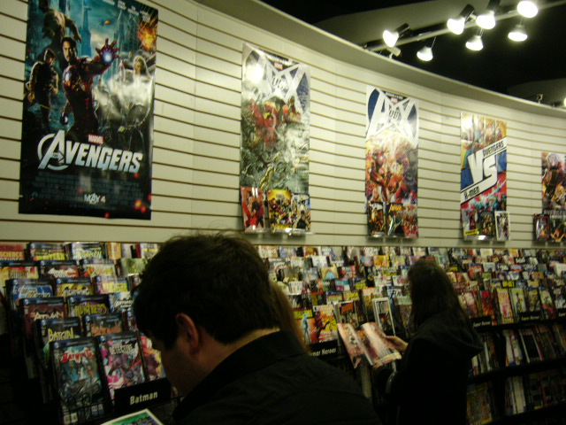
Avengers vs X-Men launch party at Comix Revolution

There are keggers, there are mic nights and there are concerts.

For the rest of us, there's the Avengers vs X-Men launch party! I attended the one at Comix Revolution, and here's how it went!

Above photo: Comix Revolution had cake and comics. Is there no better combination?

The cake was made in the cover of AvX #1. I had Cyclops' shoulder.


Here are the variant covers: the one on the left is the Jim Cheung fold-out, to the right of that is the Ryan Stegman variant, and the two up front are the John Romita Jr. ones.

Above: The party was well-attended, and Joe the cashier put up a stream of the Fox Kids X-Men cartoon. Comix Revolution is officially on Team X-Men, but didn't qualify for much more of the swag.

But cake!

Above: nerrrrrrds.

I got myself a copy of Avengers vs X-Men #1. Review to follow, on Friday.

Follow chezkevin on rss | twitter

Trades for today: The Flash and the Punisher

And a happy April to you too! It's a quick one-two trade review today, in order to settle myself in to regular content. Hint: Neither of these books are from the library; I purchased them myself, and I tend to warp my opinions to justify my purchase. Let's see if those opinions follow the rigor of a blog post.

The Punisher Max Comics Volume 6
by Gregg Hurwitz et al.
(Amazon, bargain: $16.00, regular: $29.29)
Collecting PUNISHER #61-65, PUNISHER: FRANK CASTLE MAX #66-74, PUNISHER: FORCE OF NATURE and PUNISHER MAX SPECIAL: LITTLE BLACK BOOK

I purchased this volume about two weeks ago, sight unseen from Amazon's big ol' bargain bin. The Punisher's team-up with Spidey in Amazing #577 made me curious enough to check out this huge hardcover. As of this writing, there's 8 copies left of the bargain edition: that's $16.00 for 424 pages! That's five stories spread out over two one-shots, 1 4-parter and 2 5-parters. Since different teams took over different stories, I examine them one by one:
  1. #'s 61-65: "Girls in White Dresses" I picked up the hardcover as an introduction to The Punisher, and this one doesn't work so well as an introduction. Frank gets caught up in a Mexican village, whose women are victimized by a local drug dealer, and doles out some punishment. There's a big twist mid-way that turns the traditional Punisher story on its head -- which is strong only if you've read a good amount of them (I haven't, yet).
  2. #'s 66-70: "Six Hours to Kill" What a great idea! Frank Castle has six hours to kill these two criminals, a lawyer and mayor from Philadelphia, or else he won't get the antidote. What follows is a bloody path through the city working up to these guys, but, it's still not entirely clear what the lawyer did wrong. The ride is surely exciting, but the end might require a few more re-readings to completely understand.
  3. "Force of Nature:" This one's a great introduction to the Punisher. He creates an elaborate trap to break three low-level low-lifes that have a BIG job with Russian criminals, and it works out to a "T."
  4. #'s 71-74: "Welcome to the Bayou" Here's an offbeat Frank story, where Frank meets a hillbilly shack/gas station in the middle of Louisiana. Goran Parlov draws an outrageous yet grim Frank, and it's a great ride from first issue to fourth.
  5. "Little Black Book:" No kidding, you guys. Frank hooks up with a hooker to get her black book, to kill a dude. That is how far gone he is: everything he does is for killing now. It's a great story, with great deaths and great character work.
Overall, this hardcover works as an introduction to Frank, more or less. I took a risk with this HC ($16 risk!), and I'm glad I did.

Also, hey Weekly Crisis's Ryan K. Lindsay, you got quoted on the backcover of the slipcase. Props.


The Flash: The Dastardly Death of the Rogues
by Geoff Johns, Francis Manapul and Brian Buccellato

This collects the first seven issues of the 2010 reboot of The Flash, starring Barry Allen, before the 2011 reboot of The Flash, starring Barry Allen. I'm generally a fan of the latter, so that convinced me to buy a hardcover of the former: and I don't regret it a single bit. Geoff Johns knows how to write a Flash story, cramming an amazing Flash feat into each issue, and Francis Manapul knows how to draw it. What results is a solid murder mystery. . . where The Flash is the accused! It's loud, it's exciting and it's a great story. Here are some scans:

In the very first issue, Flash -- the monarch of motion! -- tries to catch Trickster in a car, which ends up hurtling off a highway in construction, towards a father and son:


Do you see that?? Click on it and super-size the image. Flash disassembles that s**t in mid-air and saves them. Amazing. I can't tell you how many times I've reread this, just to look at these amazing spreads.


Near one of the final issues, The Flash -- the crimson comet! The sultan of speed! -- vibrates through the Top from the future and defeats him. It's insane.

One more from the first issue: when the Renegades from the 25th century return to their time, they create this "time-ripple" that ages the apartment building across the street:


The Flash runs on the building's steps before they decay in order to save each and every occupant from their building. It's. Amazing!

Comics!

Follow chezkevin on rss | twitter
Related Posts Plugin for WordPress, Blogger...

Stats a-go-go